
Kalachuchi’s Cafe: Featuring Filipino national foods and community-cultural events
UX/UI design of a mobile site for a Filipino restaurant enabling patrons to keep abreast of community-oriented cultural events and order their favorite meals.
duration: May - July 2022
role: As the product designer I was responsible for app conceptualization, UX research and design, prototypes, testing, and UI design.
Scope
Brief
Design a mobile website for a Filipino Cafe with a menu and ordering service for people on the go
Create a strong sense of cultural awareness and connection in the community.
Kalachuchi's primary target users will range in age from 13- 80. They are very interested in local cultural goings-on and eat out occasionally.
Problem
Existing mobile sites for restaurants can make ordering food easy, but many lack the education users want while perusing unfamiliar cuisines. There is a food and culture/cuisine knowledge gap that needs to be bridged.
Goals
To make ordering for pick-up or delivery as easy and efficient as possible.
To create an engaging community experience that connects people across cultures over food.
Understanding the User
User Research Summary
I interviewed five people asking them about their lives and their relation to food ordering. I had assumed, prior to researching, that all food ordering apps were generally the same, offering the same set of enhancements for people with disabilities, and were fairly easy to use.
Key learnings:
Frustrations with clunky navigation
Frustrations with not getting their orders at all
Not being able to see the food or understand the captions for the food.
lack of options for visual impairments. needs options for enlarging; text with buttons or appear on hover; screen reader technology
Pain Points
unclear copy. needs clear, concise descriptions for all images and photos
lack of imagery. need accurate photography of all offerings
need access to help. need easy tutorials for first time users and/or nudges
Personas
I worked with 2 personas for this project. Here is a problem statement from the first:
Leif is a busy, young professional who needs to be able to order his meals quickly, easily, and on-the-go, because apps and sites he typically uses don’t have great images or descriptions of the food available.
Leif Jackson
Age:
Education:
Hometown:
Family:
Occupation:
Leif has been working at a design agency for a couple years now and knows a promotion is coming. He loves working hard and spending the rest of his time playing sports - so he just wants to be able to order his food quickly and while on the go. But because of visibility issues and a language barrier, he’s run into a few mistakes with ordering food online.
Goals
To be able to order his food quickly and efficiently
He has a busy schedule so orders while on the go.
Wants to get this next promotion.
“Willing to sacrifice a lot for his goals, except the time to cook.”
29 years old
Bachelors Degree
Hoboken, New Jersey
Single
Junior designer at a firm
Frustrations
The descriptions do not make sense and there are no photos to help him understand.
Usually uses screen reading technology but it’s not available on a lot of his favorite restaurant apps
User Journey Map
Goal: Order food instantaneously and accurately (due to visibility issues and language barrier) between activities.

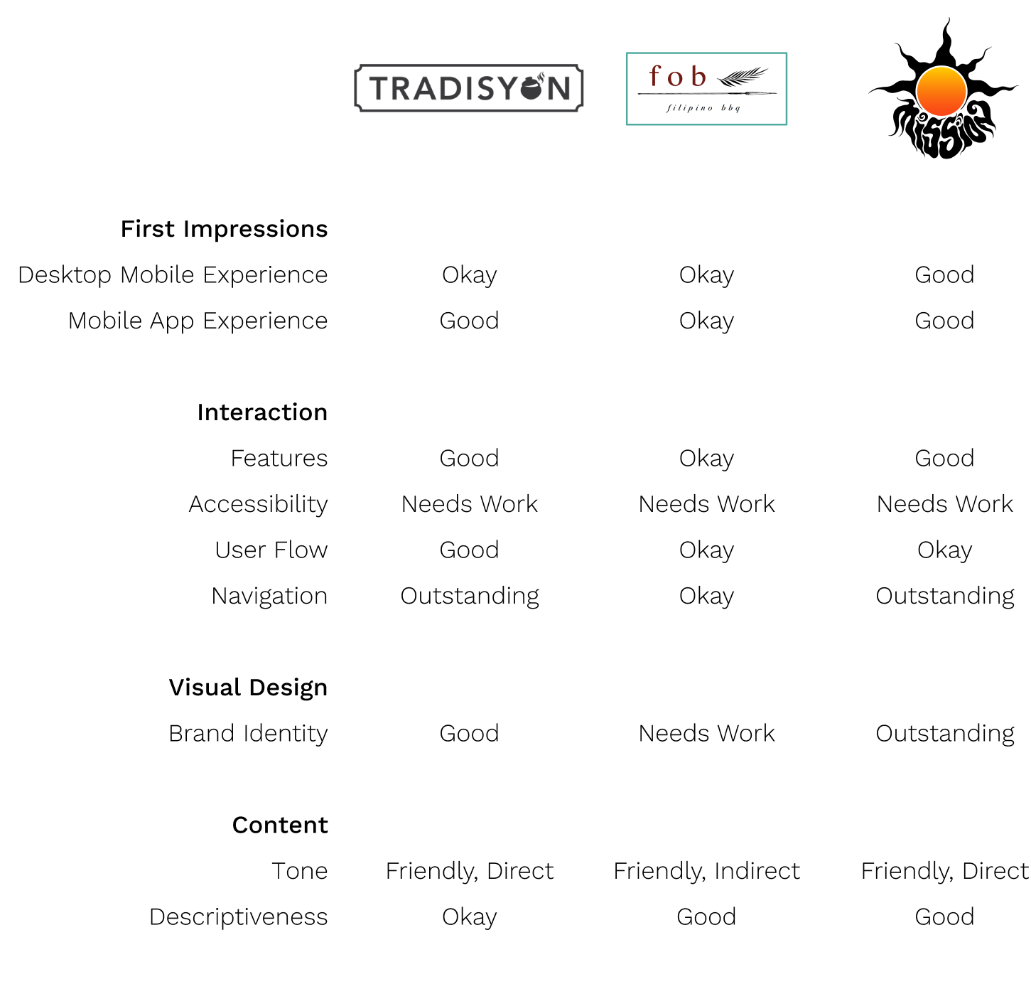
Competitive Audit
Goal: Compare the experience of opening up the app for similar restaurants, scanning the menu, choosing items for a meal and then checking out.
Starting the Design
Ideate and Prototype
After ideating and drafting some paper wireframes, I digitized initial sketches for Quizzy.News. These designs focused on the engagement aspect of the experience so that users would enjoy the news more.
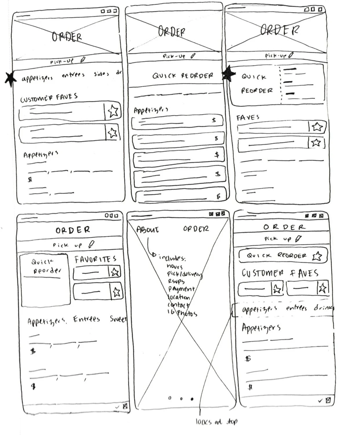
Early Digital Prototype
Starting off with several ideas for the app, this early prototype allowed me to figure out what was necessary and what needed to be refined.
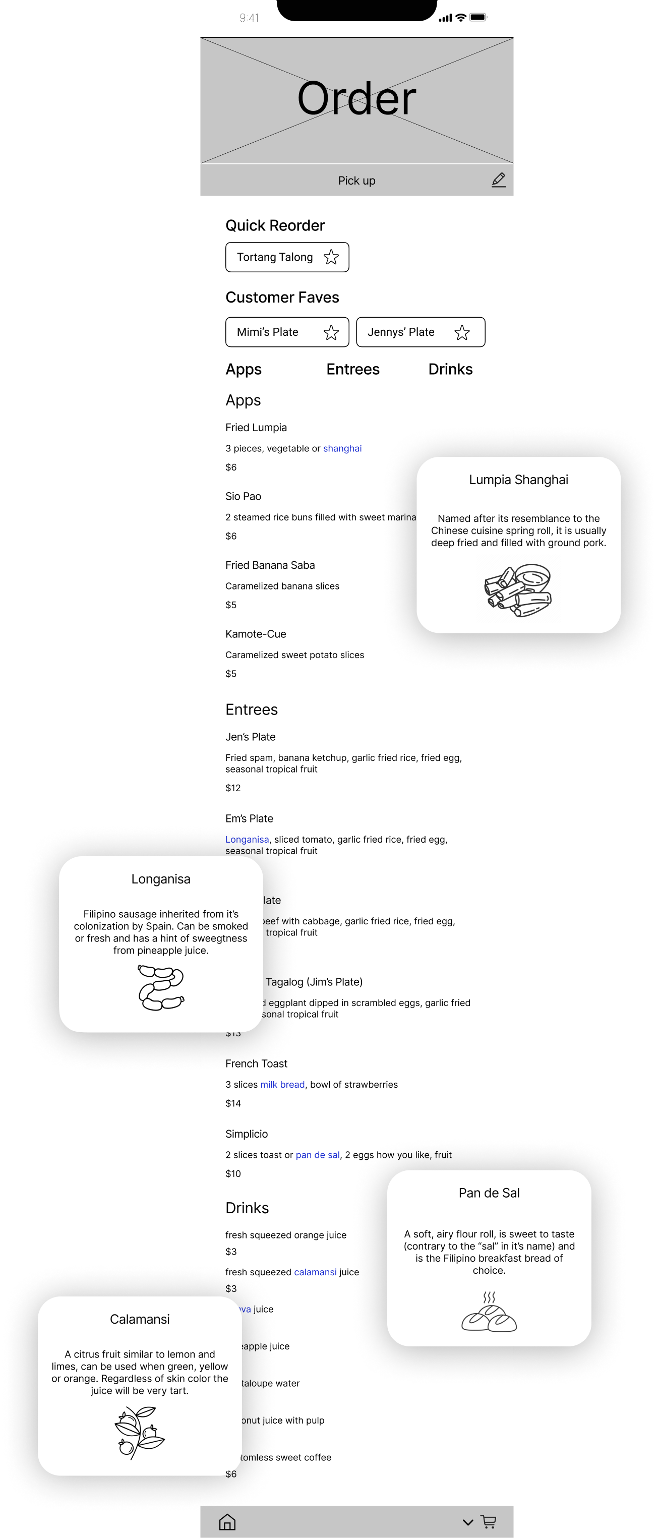
Unknown food terms will be hyperlinked to an helpful callout. Upon clicking, a pop-up describing the unknown ingredient will appear
Usability Study
Research Questions
Using the low-fidelity prototype, I conducted a user study with the following questions:
How long does it take for a user to figure out how to place an order?
How long does it take for a user to purchase an event ticket?
What can we learn from the steps that users take to place an order?
What can we learn from the steps that users take to purchase an event ticket?
Are there any parts where users get stuck?
Parameters
Round 1: three participants, 2 male, 1 female from the ages of 30 to 40
Moderated usability study
30 minutes each
Users were asked to follow four prompts using the prototype
Low-fidelity prototype used for study
Research Insights
Buttons need to be within accessible range and need to be consistent from screen to screen
Icons without explanation are confusing
Font sizing should be enlarged to make menu reading more easy
Prototype updated with research insights
Refining the Design
Later Iteration
Mockups
The initial goal was to get the concept down and make it functional. After a thorough critique on the usability, I spent time adjusting the mockup to accommodate needs for a more seamless user experience.
High Fidelity Prototype
The final high fidelity prototype demonstrates clean user flows for ordering food and/or event tickets all the way to checkout.
Accessibility Considerations
Imagery. Imagery is important for users whose first language is not English, so that is integrated as a major benefit in the use of this app.
Description Captions. Alongside the imagery are descriptive captions for each dish and each event, helping users to get a good sense of what they are purchasing.
Assistive Technology. So far, we have a prototype of the mobile site design, but ultimately, this site will be responsive for other devices. It will also support assistive technologies like screen readers.
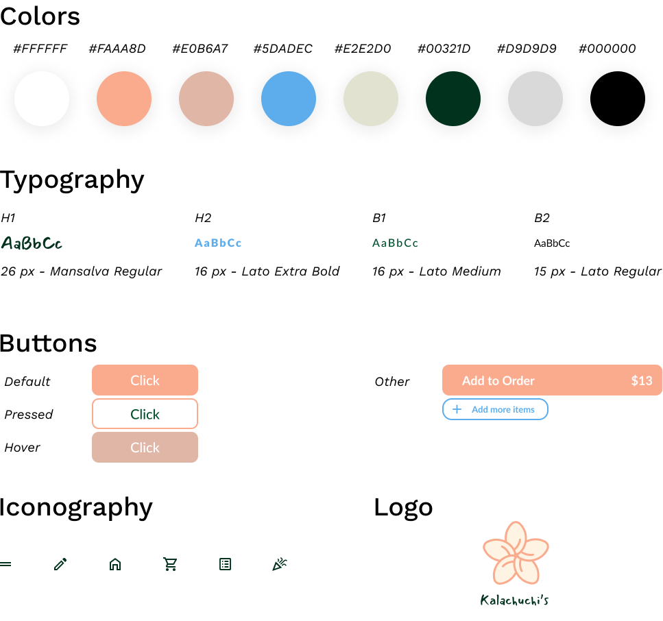
Style Guide
Going Forward
What I Learned
This experience taking an idea for a mobile site and seeing it through from kernel to completion revealed to me the value of feedback and user research. From the shared thoughts of test users to design changes, the site went through many iterations from its initial vision to the final product.
Next Steps
Gather more research, either by interviews or other methods around the idea of creating community through a local restaurant.
Expand the design to make it responsive in tablet and desktop modes.