Clicked

Overview
Summer 2023
Duration
Lead Product Designer
Role
With Clicked, I reimagined how career learners navigate an online education platform, transforming clunky, fragmented user flows into seamless, intuitive experiences. As the sole UX Designer, I led research, wireframing, and high-fidelity design—streamlining onboarding from four clicks to one, introducing guided wizards, and creating dashboards and program flows that improved engagement and aligned with Clicked’s mission of accessible career growth.
Key Objectives
Improve the user journey from marketing site to sign-up and onboarding
Simplify navigation and unify multiple systems
Streamline forms and workflows
Enhance visibility of core offerings (learning experiences)
Introduce a scalable design system and visual consistency
Key Deliverables
UX Audit & Research Findings
Redesigned User Flows
Wireframes & Interaction Design
High-Fidelity Mockups
Prototype of GPT-Powered Learning Experience
Design System Integration
Solution
I redesigned Clicked to make career learning simple and intuitive—reducing friction, clarifying navigation, and streamlining onboarding from multiple clicks to one. Learners can now join experiences with confidence, track progress in a unified dashboard, and focus on growth instead of getting lost in the process.
The Challenge
Transforming a Career-Ed Platform for Clarity and Engagement
Clicked is a platform helping learners gain career-advancing experience through active learning and coaching. My task was to overhaul its clunky, confusing user experience and create a seamless journey—from marketing pages to onboarding and learning experiences—while honoring the company’s mission: making career growth accessible, intuitive, and enjoyable.

A snapshot of the old Clicked experience.
My Role
From Audit to High-Fidelity Design
As the UX Designer, I led wireframing, prototyping, interaction design, and visual design, alongside UX research. Working closely with the CEO and Head of Product, I designed navigation improvements, simplified onboarding, and optimized forms to reduce friction. My goal: make Clicked’s core offering—learning experiences—front and center for users.

Early sketch of a wireframe and annotations
The Process
Turning Complexity into Simplicity
I started by auditing three existing user flows and defining ideal states for each: organic site visitors, experience-driven sign-ups, and targeted program entry points. Pain points included long forms, poor navigation, and disjointed dashboards. Through iterative flows, I cut unnecessary steps (from 4 clicks to 1 for account creation) and introduced a wizard-style onboarding for a smoother experience.

Comparison of the old and new user flow diagrams.
Design Solutions
A New Dashboard & Experience Pages
After mapping flows, I created wireframes and high-fidelity mockups for critical screens: landing pages, dashboards, program pages, and an improved LMS experience. I unified disparate systems into a single platform, making navigation intuitive and the design visually cohesive using Clicked’s design system components. Iteration was key—some screens went through seven refinements.
When a learner begins a new Learning Experience: this is the final high-fidelity flow.
Below are some of the final high fidelity screens I delivered to Clicked

Final Landing Page
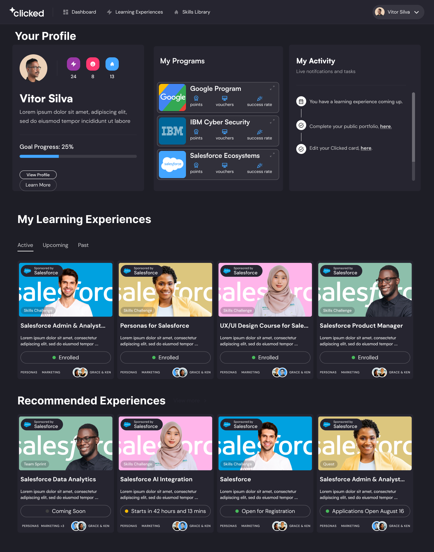
Final Dashboard
Final Coaches Page

Final Skills Page
Rapid Innovation with GPT
Building a GPT-Powered Learning Experience in One Week
Mid-project, the CEO needed a brand-new AI-driven experience for an investor pitch—within a week. I jumped into rapid ideation, sketched user flows, and prototyped a solution where learners received real-time, GPT-powered feedback. After four days of tight iterations, we delivered a polished prototype. The result? High engagement and a successful pitch.

Impact
The redesigned flows and layouts dramatically simplified onboarding, improved learner engagement, and gave Clicked a flexible, modern design foundation for scaling new learning experiences.